Types
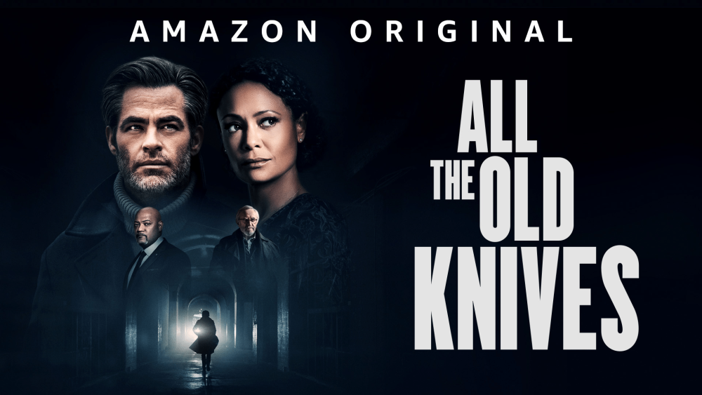
Cover art
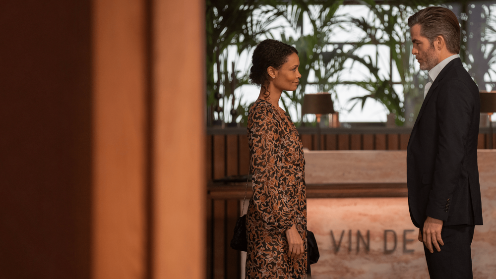
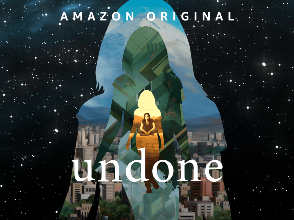
16:9Appears in browse when a customer views multiple titles together, usually in carousels. The title treatment (movie title) must be present on the cover art.
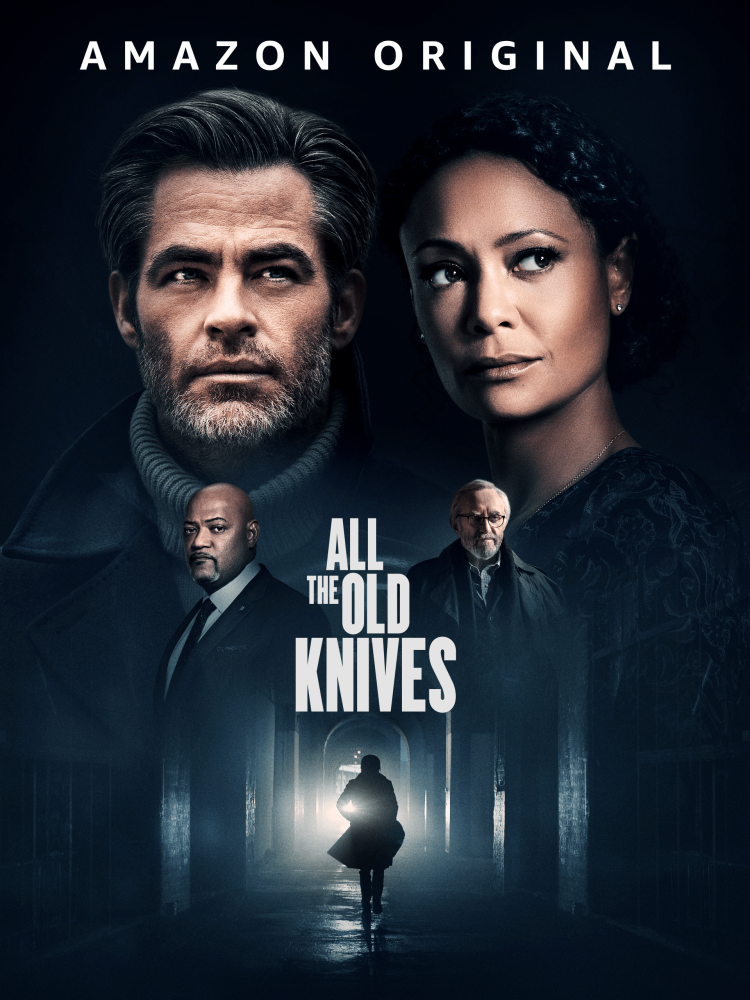
Box art
3:4 / 4:33:4 for movies, 4:3 for seasons. Appears in search. The title treatment (movie title) must be present on the box art.
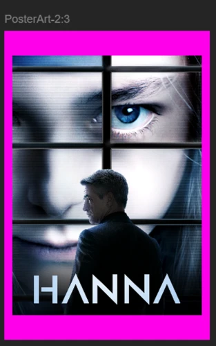
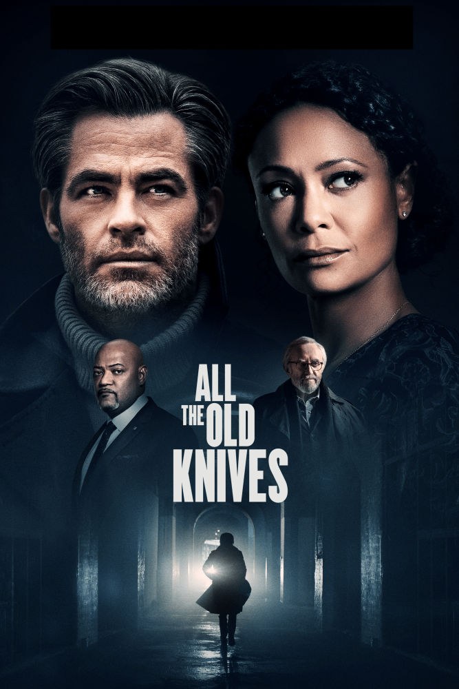
Poster art
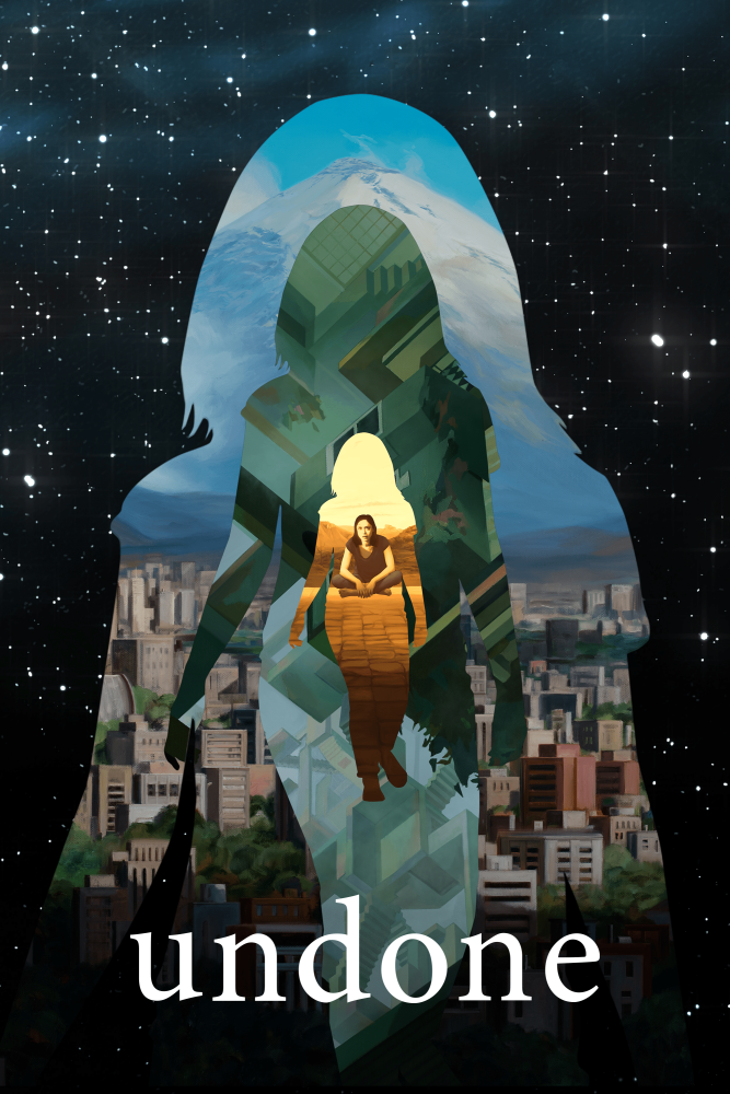
2:3Appears in browse when a customer views multiple titles together, usually in carousels. The title treatment (movie or series title) must be present on the poster art.
Hero art
16:9The main background on detail pages behind the title metadata (main title, rating, synopsis). Must be free of any text elements unless it's part of the overall image — e.g. a sign behind the protagonist.
Title art
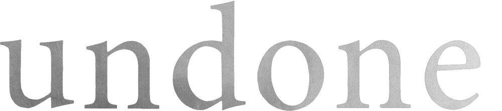
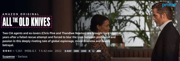
FlexibleThe movie or season title treatment, delivered as a .png with a transparent background. Bright colors are recommended for high contrast against a dark background. Supported for movies and seasons.
Episodic art
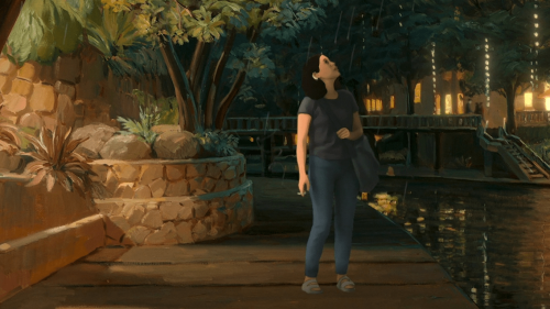
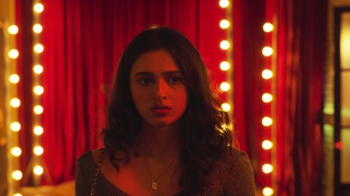
16:9Provides episodic context without revealing spoilers; appears on detail pages alongside the episode. Usually a still, free of text unless part of the image itself.
Trailer & bonus art
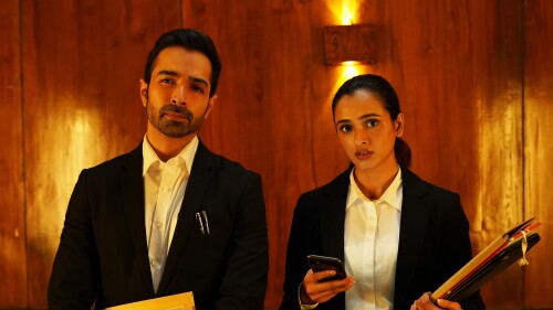
16:9Captures context for the trailer or bonus content — usually a still from the material, free of text unless part of the overall image.
Movies artwork
Season level artwork
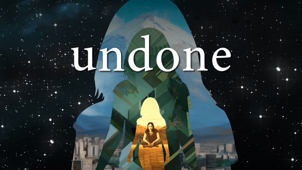
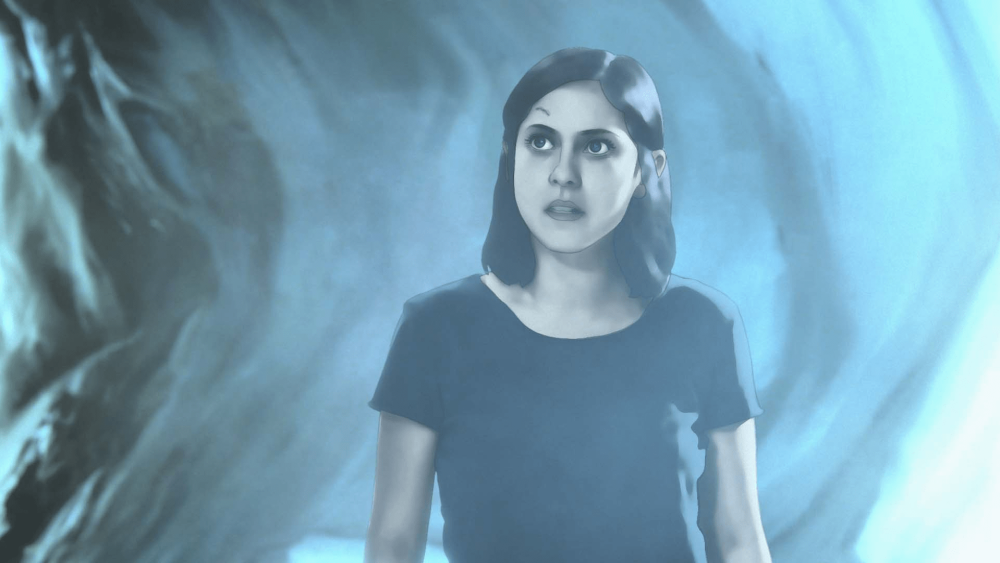
Episodic artwork
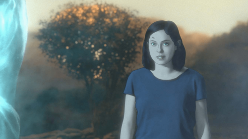
TV trailers & bonus content
Technical specifications
Resolution and aspect ratios
| Type | Preferred resolution | Minimum resolution | Aspect ratio | File size limit |
|---|---|---|---|---|
| Cover art (movies and seasons) | 1920×1080 or 3840×2160 | 1920×1080 | 16:9 | 10 MB |
| Box art (movies) | 1920×2560 | 1200×1600 | 3:4 | 10 MB |
| Box art (seasons) | 2560×1920 | 1600×1200 | 4:3 | 10 MB |
| Poster art (movies and seasons) | 2000×3000 | 2000×3000 | 2:3 | 10 MB |
| Title art (movies and seasons) | 2200×960 | 1100×660 | Flexible | 1 MB |
| Hero / background art | 1920×1080 or 3840×2160 | 1920×1080 | 16:9 | 10 MB |
| Episodic art | 1920×1080 | 1920×1080 | 16:9 | 10 MB |
| Trailer & bonus art | 1920×1080 | 1920×1080 | 16:9 | 10 MB |
Image attributes
| Format | JPG or PNG |
|---|---|
| Color space | RGB |
Title art must be delivered in .png format with a transparent background.
↑ Back to topGuidelines
Guidelines and best practices for title art include the following:
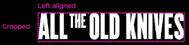
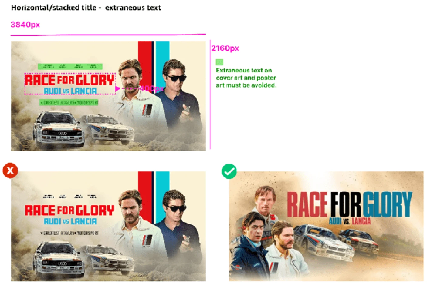
- If multiple versions are available, horizontal title art is recommended instead of stacked art, to better occupy available space on the display page. Stacked versions are often illegible.
- Shouldn't include any additional details such as branding, cast name, etc.
- Use high-contrast colors that work best against dark backgrounds.
- Must be cropped from all sides.
- Avoid adding small text.
Required safe zones
Different art types have specific safe zone requirements that control how much of the image is visible.
Movie and season cover art
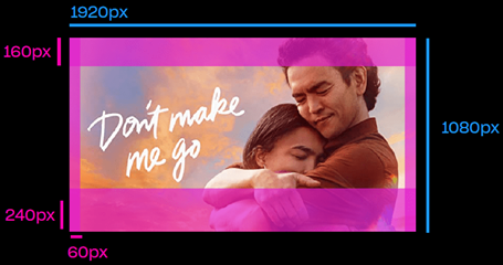
Safe areas based on a 1920×1080 image:
Movie and season poster art
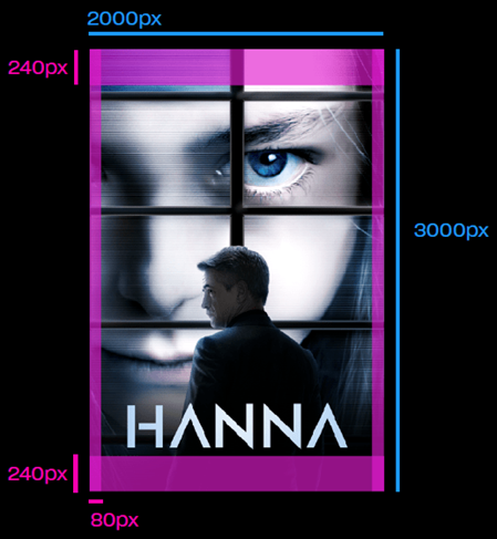
Safe areas based on a 2000×3000 image:
Hero (background) art
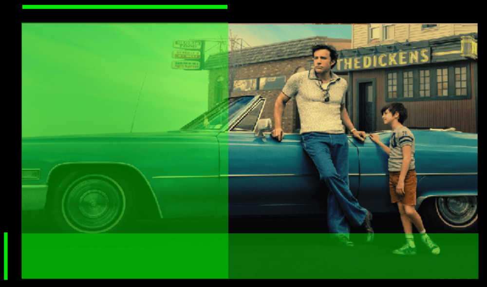
Place background art with visual details on the right side of the artwork. On living room and web devices, the left side is covered with a UI overlay gradient and metadata.
Templates with safe zone overlays are available for download.
↑ Back to topRight-to-left background art
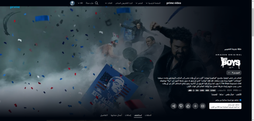
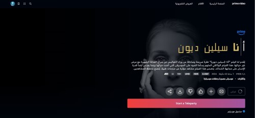
Because Arabic and Hebrew are read right-to-left, customers with their UI language set to Arabic or Hebrew will see the overlay metadata/text on the right side of the display page instead of the left. An RTL version of the artwork is therefore required if you are publishing a title in the following territories:
Correct RTL artwork
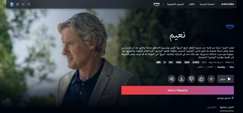
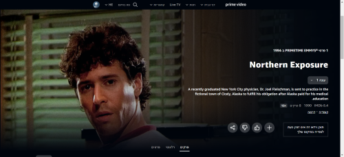
Default LTR artwork — text overlay obscures the image
For more information, search for the defect code IQRTL in Quality measurement and feedback.
Artwork text legibility
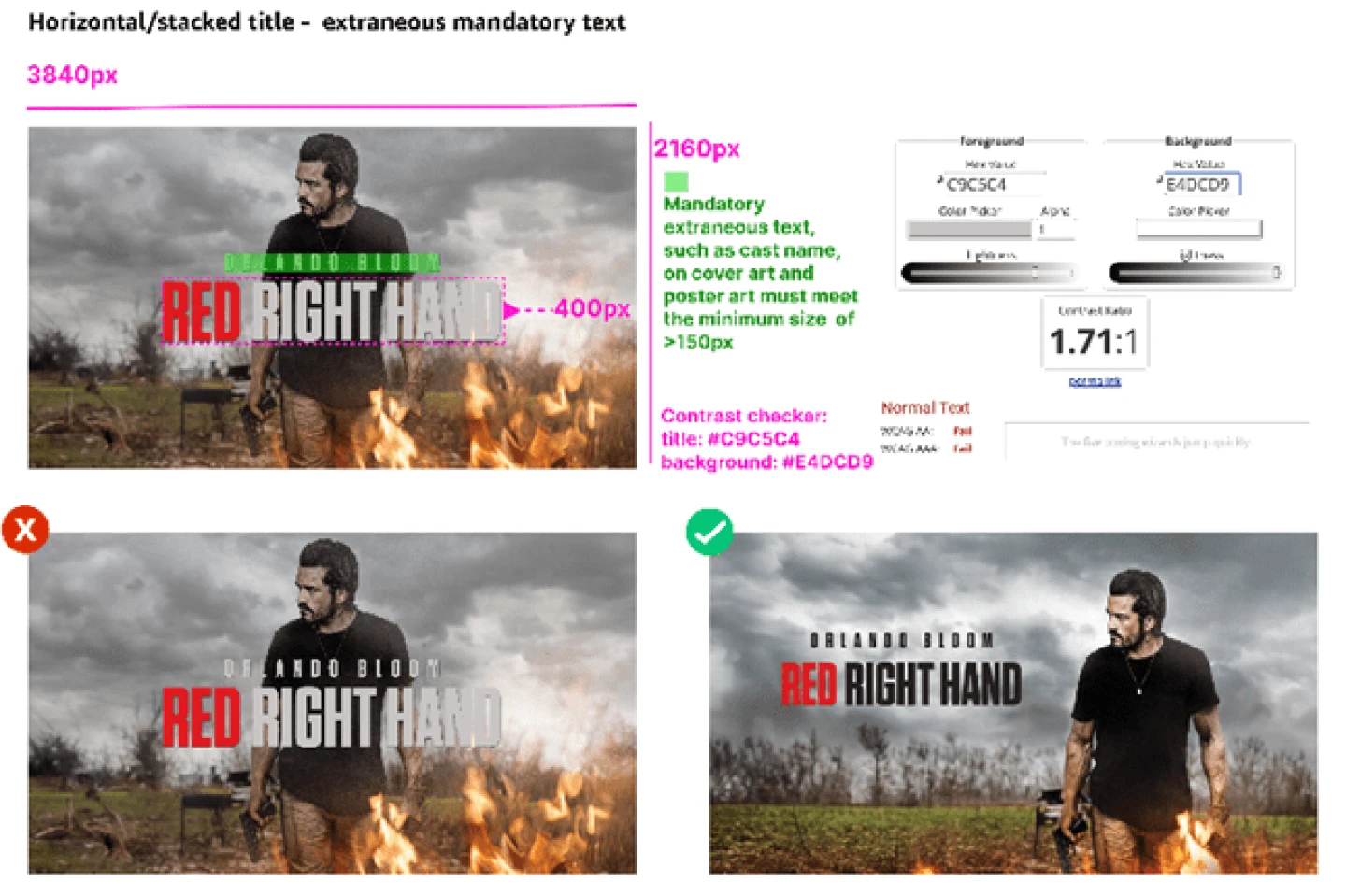
Text legibility is a critical requirement in artwork, so audiences can clearly read title information. When title treatment or text is present on artwork delivered to Prime Video, it must be clearly displayed and legible across all device types. A common defect appears on smaller devices (such as mobile), when text is too small to be legible. If your artwork contains illegible text, you must create an alternate and re-submit or re-deliver it.
Follow these guidelines to deliver high-quality, legible Cover Art and Poster Art across Prime Video apps and services.
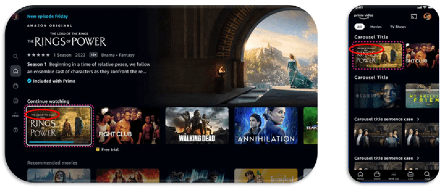
Overall, the minimum size for text on artwork images must be:
The minimum text size applies to secondary text, or to the smallest text size (in multi-line text) that appears as part of the title art. These requirements are based on customer experiences across many types of content and all devices Prime Video supports.
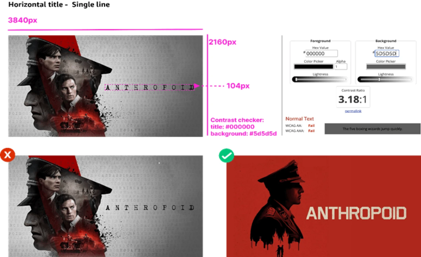
Title font size vs. contrast
Contrast between the title text color and background must meet legibility standards for both size and contrast. In accordance with Prime Video accessibility guidelines, visual presentation of text and images of text must have a minimum contrast ratio of 4.5:1.
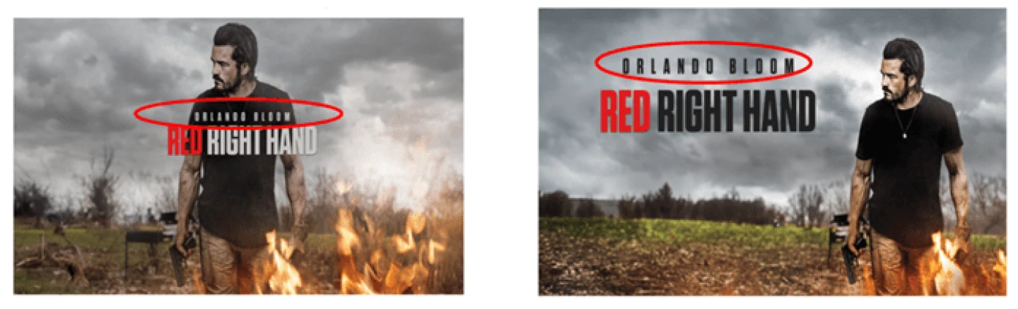
There are many variations of title art text styling. To measure the size for legibility, consider the full height of the title — in some cases, legible title art text can take up to 50% of the height of the whole Cover Art or Poster Art asset.
Featured Originals and Exclusives carousel
The Featured Originals and Exclusives carousel is a prominent carousel at the top of the Prime Video home page. Partners can use it to showcase titles to subscription customers in a highly visible location.
Poster Art (2:3) must be submitted by the partner to include a title in the carousel, per the spec in Artwork requirements. Partners may burn in text to denote whether the title is an Original, in the non-pink highlighted areas shown below.